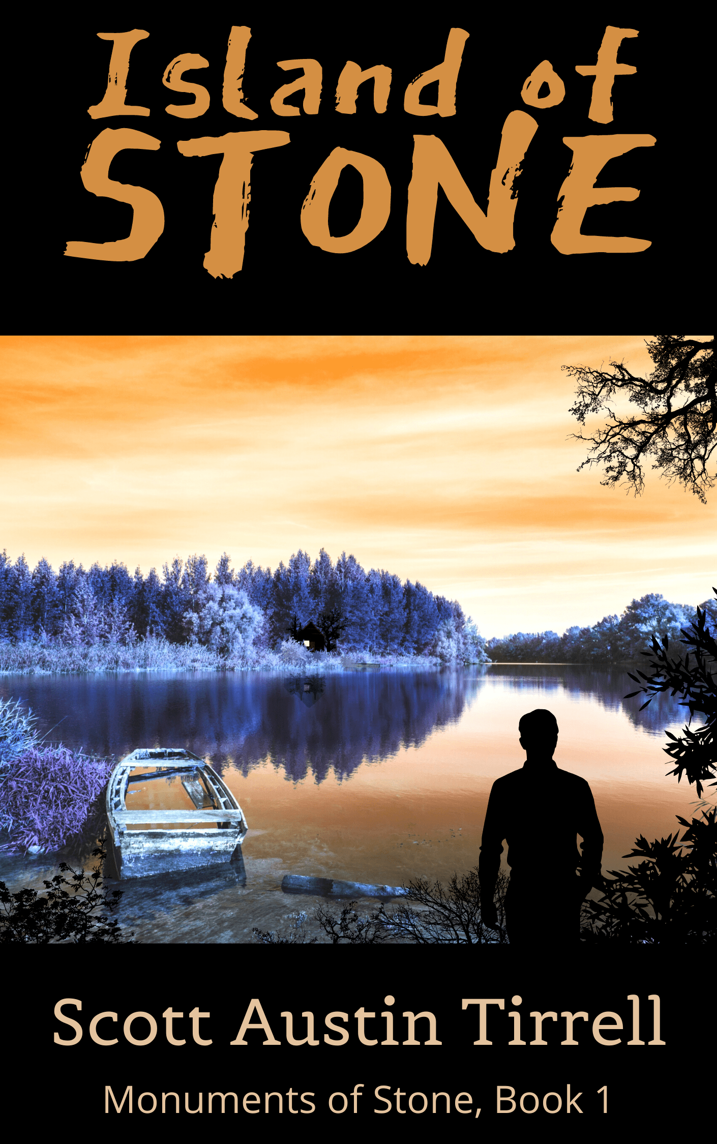
The Island of Stone has a new look! After much deliberation, I decided to change the cover of my first published book. The original cover will always have a place in my heart and looks great in person, but it just didn’t show well online. I created the design several years ago before the notion of self-publishing crossed my mind, and thus it was designed for the shelf, not the screen. It is a bit dark on the screen and the picture a bit busy. The title also shows up small in a thumbnail. I’ve known it was an issue for a while, but the prospect of changing such a fundamental part of the book this far in was scary. It changes every aspect. But, sometimes, you have to be bold. As you may have seen, I have been creating a lot of advertising and promotion material, and my skills in the area have grown. Yesterday, I was putting together my twitter ads for the week, and I looked at the cover and said, that’s it!
The book cover is probably the most critical tool for sales. I hate to say it, but its perhaps even more important than the writing itself. How often have you bought a book because it had an excellent cover, only to find that it was the only thing good? It is the first thing someone sees and pushes a potential reader to the actual sample. If they don’t make that vital leap, then there is no hope. My Amazon marketing data showed lots of impressions, but few clicks, meaning people were seeing the ad, but just weren’t clicking on the cover. That means, it wasn’t visually appealing to them or it was missing out against others.
The new cover is a significant improvement. I hope you agree. The title, author, and series title is much larger, and the colors rich and vibrant. I’ve always liked the combination of red and black, and my designs tend to favor this pairing, but I love any vibrant color paired with black, and I’m glad I went this new route. Orange and purple are on opposite sides of the color wheel, and that contrast is visually stimulating. Orange causes excitement and attracts attention. It also invokes a feeling of Autumn (the season the book takes place). The purple twists the enthusiasm of the orange from happy excitement, to perhaps a fearful or mysterious excitement. The orange and black, of course, makes you think of Halloween, and people who love that holiday will love this book. At least, that’s the color theory. The image matches the scene in my head very well and instills the feelings of mystery that I want. The silhouette is perhaps Trevor looking towards the island and its cabin’s forthcoming adventure. I dialed in the sizes and proportions, so everything looks suitable for the thumbnail size, but still looks great up close. I then asked my community which of the designs they preferred. The overwhelming consensus was the new cover was far better. If you agree or disagree let me know in the comments or send here.
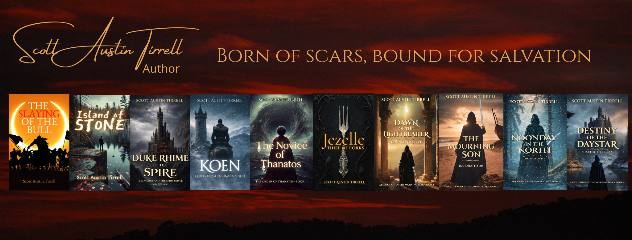
Using this template, I then updated the rest of the future covers for the series, so that that they are all related. You can see them here. I then had to update all my promotional pages, social media, trailers, banners, and advertisements. Now, I’m just waiting for Amazon to approve the paperback version. The e-book version is already up.
It was a scary decision, but I’m glad I made it. This journey is all about growth and sometimes growth is frightening and uncomfortable, but once you pass that point and the fruit grows upon the limb, it is sweet indeed. I now feel that the Island of Stone has a cover worthy of the great story it contains. If you haven’t already, check it out! I welcome feedback, and a positive review would be excellent! My second book, The Slaying of the Bull is also available.
Cheers!
Discover more from Author Scott Austin Tirrell
Subscribe to get the latest posts sent to your email.
