Every book cover makes a promise. But sometimes, it takes five versions to make the right one.
When I first published Dawn of the Lightbearer almost four years ago, I was driven by story, passion, and vision—less so by design experience. I have an eye and real-life artistic skills, but digitally producing a book cover was trial and error with limited tools and know-how.
I knew I wanted a cover that symbolized emergence: the beginning of a journey, the first glimmer of something powerful and dangerous.
But the Absolution of the Morning Star series is not a story of rising. It’s a story of bearing.
And the light at its center—Lightbearer—is not divine. It’s a prison.
Over time, all the series’ covers have evolved with the story and with me. And now, five iterations later, Dawn of the Lightbearer’s finally reflects the truth of what lies inside.
Version 1: The Sun Rises
This was the original—my first attempt to capture the book’s heart—a lone, hooded figure raising a sword into the sun between ancient columns. The orb was intentionally the sun, symbolizing “the dawn,” as referenced in the title. It evoked classical fantasy tropes: chosen ones, morning light, heroic beginnings.
At this point, what did I know? The story had only just begun. At the time, it felt right. The title was “Dawn,” after all. But the book’s tone was darker than the cover let on, and it only grew darker as the series progressed. Erikson Gray doesn’t rise in glory—he is pressed into it. The light he holds has the potential to bless, but it also consumes.
Version 2: Shadows and Branches
In the second iteration, I introduced creeping branches along the sides of the frame and brightened the color to make it pop. This created contrast and guided the eye more clearly toward the sword and orb. The sun still dominated, but the world around it felt tighter, more confined. At this point, I was beginning to feel the cover wasn’t right, but I was afraid to change it too much after investing so much in this identity.
So, this version was about focus. I was learning to manipulate visual weight–darken the periphery to sharpen the center. I also felt the branches implied some creeping darkness to better situate the book in dark fantasy. But even with these tweaks, the mood remained triumphant. Too heroic. Too mythic. And the light still read as hope rather than warning. It was time to get bold.
Version 3: The Real Shift – A Sword That Drags

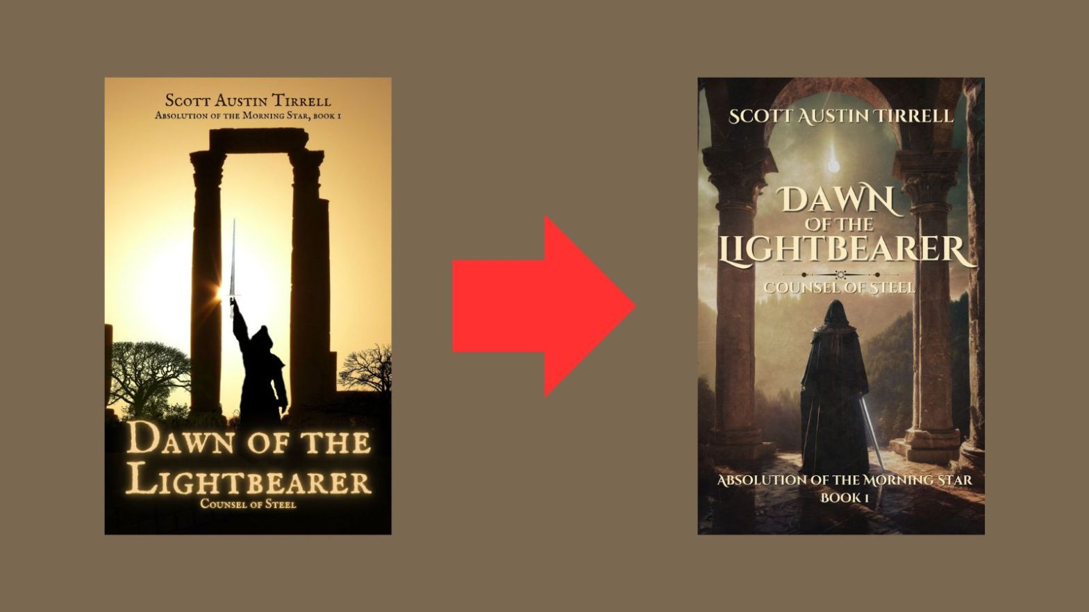
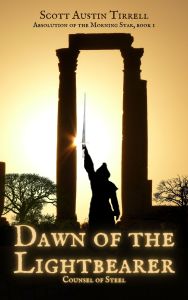
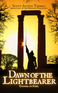
This was the turning point.
Here, I abandoned the silhouette style and created a more realistic, painted-like cover. The figure no longer raises the sword. He drags it. The light no longer crowns him—it hovers, distant, uncertain. The pose changed everything: from triumphant to burdened.
And critically, the orb above him? No longer the sun. It’s the Morning Star—Venus.
This moment reframed the entire story. I wanted to imply not just a celestial event but a fall. Venus has long symbolized Lucifer—the light-bringer cast down. And in my world, Lucifer is imprisoned within the sword Lightbearer itself. The sun—the symbol of God—is off-frame, above, unreachable. It still casts light into the scene but is no longer present.
That celestial body—Venus—isn’t a beacon. It’s stolen light, stolen grace. A sign that something has fallen. Something divine, now caged. The theological and mythic implications are layered here: God above, absent; Lucifer below, bound in steel.
Erik is caught between them, and what Erik carries is not grace. It’s judgment.
This version also marked a technical leap forward—more texture, realism, and alignment with the tone of grimdark and philosophical fantasy.
Version 4: Golden Warmth (That Missed the Mark)
With the fourth cover, I tried something warmer. Rich amber hues soaked the ruins, echoing the warmth of an early sunrise. It was an aesthetic experiment—one I hoped would bridge beauty with foreboding.
But it backfired.
The glow made the image feel hopeful again. Worse, it muddied the contrast. The title began disappearing, especially in thumbnail view—critical on Amazon KDP. And despite the improved mood, it once again suggested ascent over descent.
The light was beautiful. But it was the wrong light.
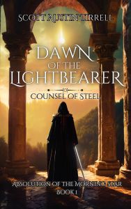
Version 5: The Morning Star Ascendant (or Descendant)
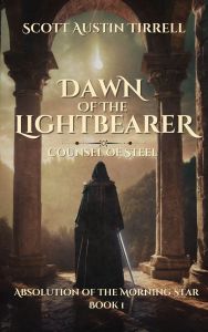
This final version is the one that fits.
The light is cooler and more muted. The shadows are heavier. The stone ruins now feel old, pitted, and real. I added grit and a slight vignette to focus the eye.
This version finally places the book where it belongs: in the tradition of dark fantasy, where faith is tested, power is corruptible, and light can burn just as cruelly as shadow.
Most importantly, the title finally pops. It stands proud against the backdrop—legible, grounded, and unmistakably genre-appropriate. The change is fresh, only a few days old, but I hope this version will perform better in ads, click-through, and reader retention. It’s honest. It’s arresting.
It’s the truth.
What about the other books?

So, that was the process for Dawn of the Lightbearer, but it is the first book in a series, and therefore, its three brothers needed work, too, for continuity. They all suffered from one flaw–they were too bright and fell into a color scheme more associated with high fantasy. I like sharp colors and visual contrast, but I have to be true to the stories contained in the books. As dark fantasies, they needed to be, well, darker, but also grittier. I love my core images, so I couldn’t change that, but I could change how they were presented. I darkened, and muted, and added vignettes and grit overlays, but more importantly, I made the titles bolder and with colors adhering more to what is found in the genre.
Final Thoughts
Five covers. One story. I started with a sun. I ended with a falling star.
Thank you for walking this path with me. And to those who picked up the book in its earliest form—thank you for seeing the light even when it was a little too bright. The sword still waits. But it no longer shines for glory… not yet, anyway.
Cheers!
Discover more from Author Scott Austin Tirrell
Subscribe to get the latest posts sent to your email.

“Dawn of the Light bearer” is particularly striking! Love what you’ve done with these covers!
LikeLiked by 2 people
They all look intriguing, Scott.
LikeLike
Loved this cover journey…fascinating… 👏🏻
LikeLiked by 1 person