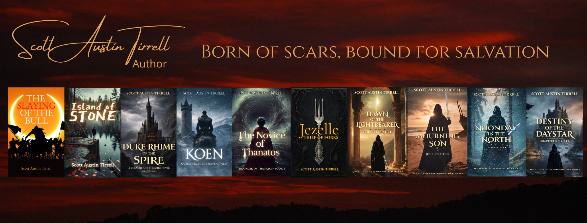
The old adage that you shouldn’t judge a book by its cover is probably true, but everyone falls victim. The cover is often the reader’s first introduction to the work. As they scroll through page after page on Amazon, the cover thumbnails are the first things they see, and if something visually interests them, only then do they click and delve into the prose.
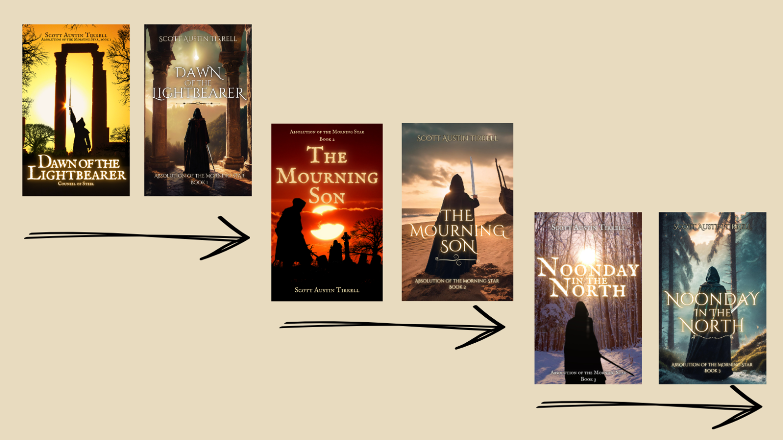
Thus, after much deliberation, I changed the book covers for my Absolution of the Morning Star series. It was a challenging decision. The Dawn of the Lightbearer’s face has been with me for almost three years. It became a visual friend I could easily pick out of the crowd. The Mourning Son and Noonday in the North were with me shorter, but not by much. I created all the covers for the series at once to have something to show visually on my website (see the entire series’ facelift here). This amounts to a complete rebranding that involves updates to all my ads, website, and social media. It also risks losing some customers, but I don’t have many, so that doesn’t concern me much 😉
As I’ve evolved through this journey, I’ve acquired many new skills, including some proficiency in using powerful media editing tools to market my books. The original covers for the series were alright, especially considering what I had to work with at the time, but the more I learned, the more I realized I could do better. I also developed a keener eye on the industry standards. I’ve spent much time (too much) researching the competition, scrolling through page after page of eye-catching covers. The longer my covers were out there bumping elbows with the professionals, the more I realized a few things:
- I needed better series continuity. The original composition had a shared theme, but the color scheme varied too much. I need to tighten.
- I had to move away from the black silhouettes. I originally went this route because I liked the juxtaposition of black against vibrant color, and it had the added benefit of not having to worry about the lighting on my character. But ultimately, it was a cop-out. Readers want real images with detail.
- I wanted the covers to tell a more robust story that visually matched the books’ blurbs. The general form of the new covers remains the same for Dawn of the Lightbearer and Noonday in the North, I just added some crispness. The most drastic change is with The Mourning Son. I had created the original cover before I wrote the book. Now, it matches the book’s story far better, especially its blurb.
- I wanted the new covers to match the styles often seen in the dark fantasy genre and resonate better with the books’ themes. Before settling on these new covers, I tested another design that gave Erikson Gray a face. Ultimately, I decided it looked to “Young Adult,” and that’s not the market for my books. You can still see these on my Instagram.
- Generally, I wanted the covers to look more professional. I received feedback from a reputable source that I needed to up my game, and it was the straw that broke the camel’s back.
I have no dissolutions. Yes, I, too, have seen plenty of stories about how authors changed their covers and saw sales skyrocket overnight. I know that won’t happen to me. I’m just not that lucky. Also, my books have been out there too long. Barring some miracle, they ain’t ever going to be best sellers. But I’m happy with their faces now and no longer feel disappointed when my covers appear in search results, which helps my confidence level. I will take what I learn from this series and apply it to the next- maybe even Koen if I ever get it off the ground (I’m playing with the idea of making it part of a duology). It’s all a journey. We cry, we learn, we grow, we blossom.
Cheers!
P.S. Tell me what you think. Have I made a horrible mistake? Let me know in the comments!
Discover more from Author Scott Austin Tirrell
Subscribe to get the latest posts sent to your email.

If it’s not working then let it go.
Joyce
LikeLike
I can’t claim to be an expert in this area, but I think your new covers are well done.
LikeLiked by 1 person
Thanks!
LikeLike
Love the new covers!
LikeLiked by 1 person
Thanks!
LikeLike
I like the new covers, Scott.
LikeLiked by 1 person
Thanks!
LikeLiked by 1 person
The old covers weren’t bad, but the new ones are wonderful!
LikeLiked by 1 person
Thanks!
LikeLike